Physical Address
304 North Cardinal St.
Dorchester Center, MA 02124
Physical Address
304 North Cardinal St.
Dorchester Center, MA 02124
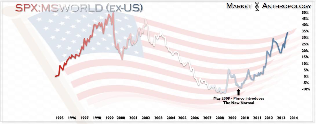 |
| Click to enlarge image |
All joking aside, we have tremendous respect for Mohammed el-Erian’s sharp investing acumen and intuitive market philosophies. To his credit, many of the economic, monetary and fiscal predictions outlined by him in 2009 have held up. Growth has been disappointedly sluggish and unemployment stubbornly high. He was also on the mark initially in anticipating that emerging markets would lead the way in the recovery. Where his and many participants expectations went astray was assuming the shift in economic leadership away from the U.S. and the dollar to developing nations (particularly in Asia) – had room to run. In true contrarian fashion, the concept practically top ticked the balance of the world’s outperformance (namely China) in the recovery and a major pivot for the dollar.
 |
| Click to enlarge image |
Today, as conventional market wisdom has firmly embraced the notion that the U.S. under the stewardship of the Fed is the safest neighborhood to park ones capital, the original tenet of outperformance by developing nations – particularly China, is now overgrown with pessimism and stands of contrarian tinder.
While we agree it looks rather bleak in the East right now, we know markets have been discounting these conditions for some time. Considering the Fed has written the textbooks for applied monetary intervention, we wouldn’t be surprised to see China pull a page or two in the coming months or even write a new chapter of their own.
For reference, our Shanghai Composite comparative with the SPX, circa 1982 – may hold some clues.
 |
| Click to enlarge image |